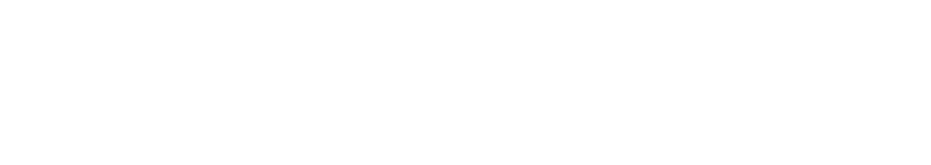

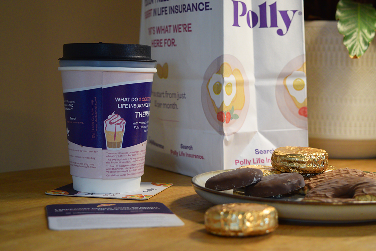
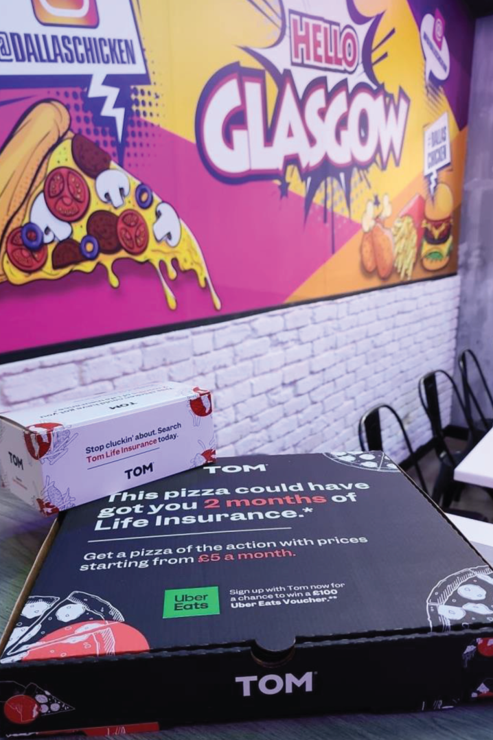
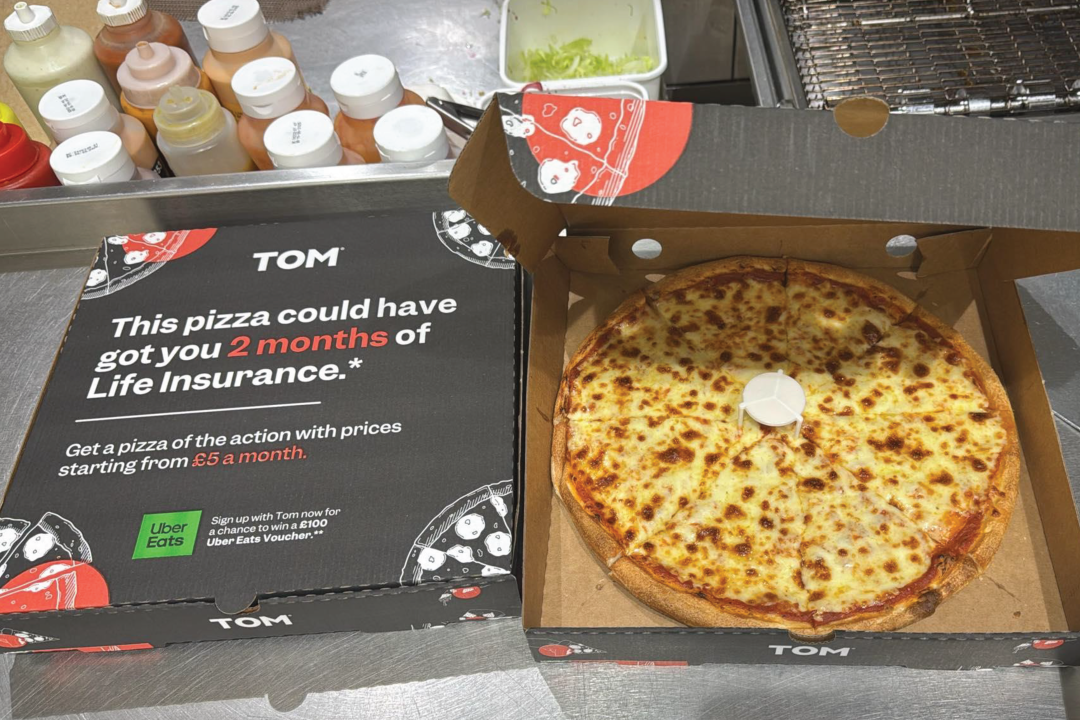
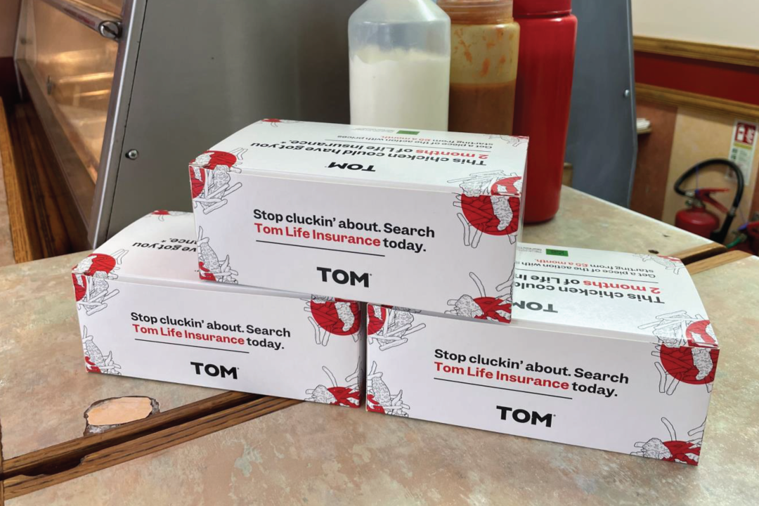
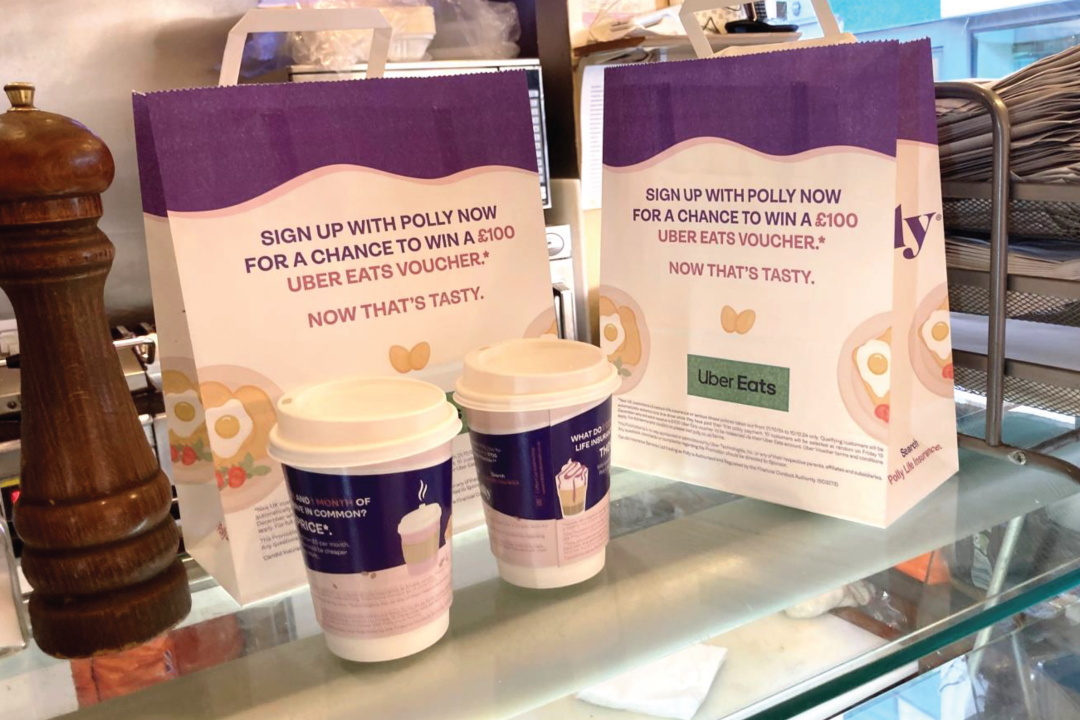
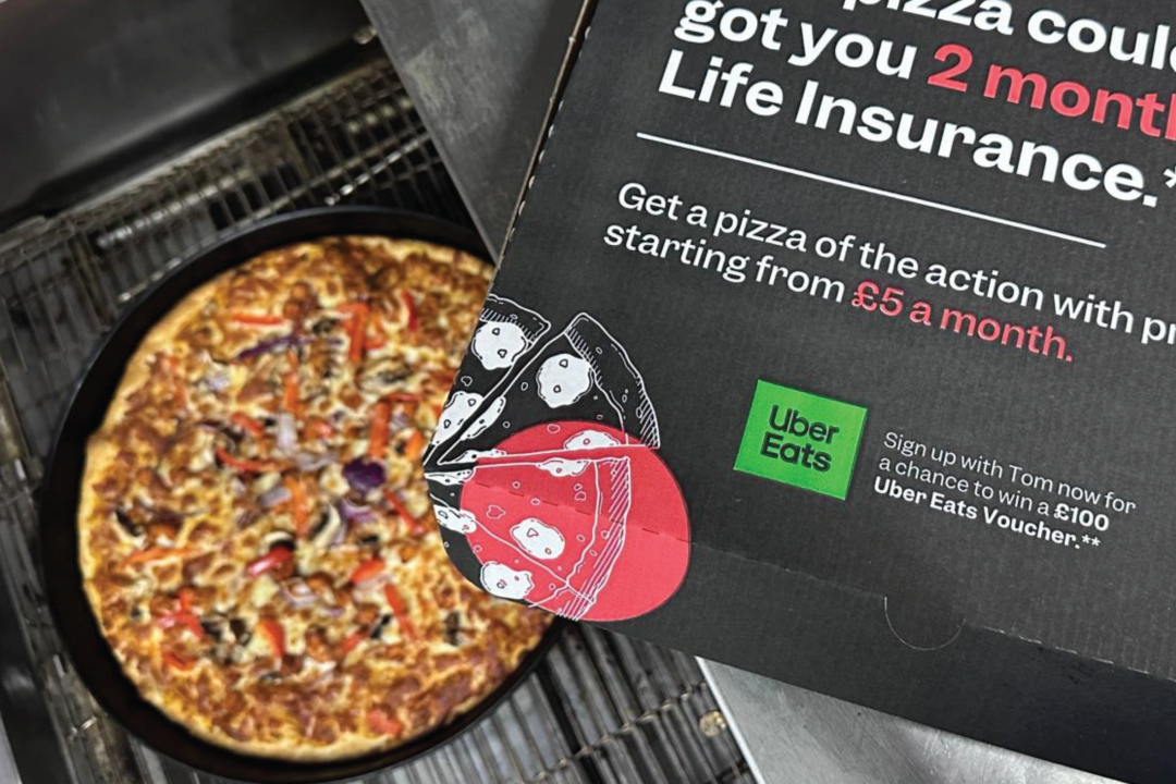
This idea came about off one of our old celebrity talking head pieces before I started at the company. The celebrity was talking about a disappointing takeaway they had had that weekend and comparing what they paid for it to however many months of life insurance they could’ve got for it. Thus, the Takeaway Campaign was born.
Working closely with the head of brand copy at the time, I designed and developed all the OOH material that we would distribute as part of this campaign. Making sure to stick to the Tom and Polly brands, I wanted to bring in a more interactive element to the packaging. The content alone worked well but I wanted to explore the angle of remembering a design purely for the little quark it had or unique style.
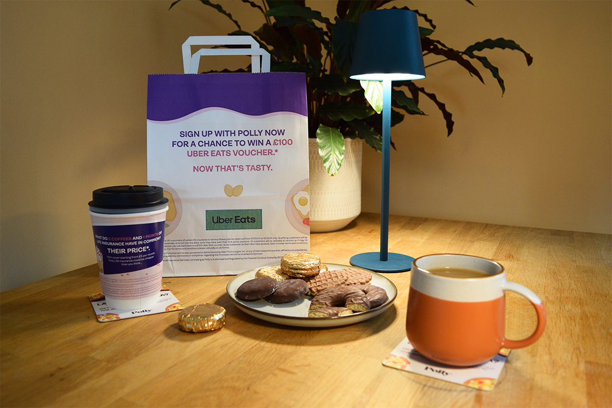
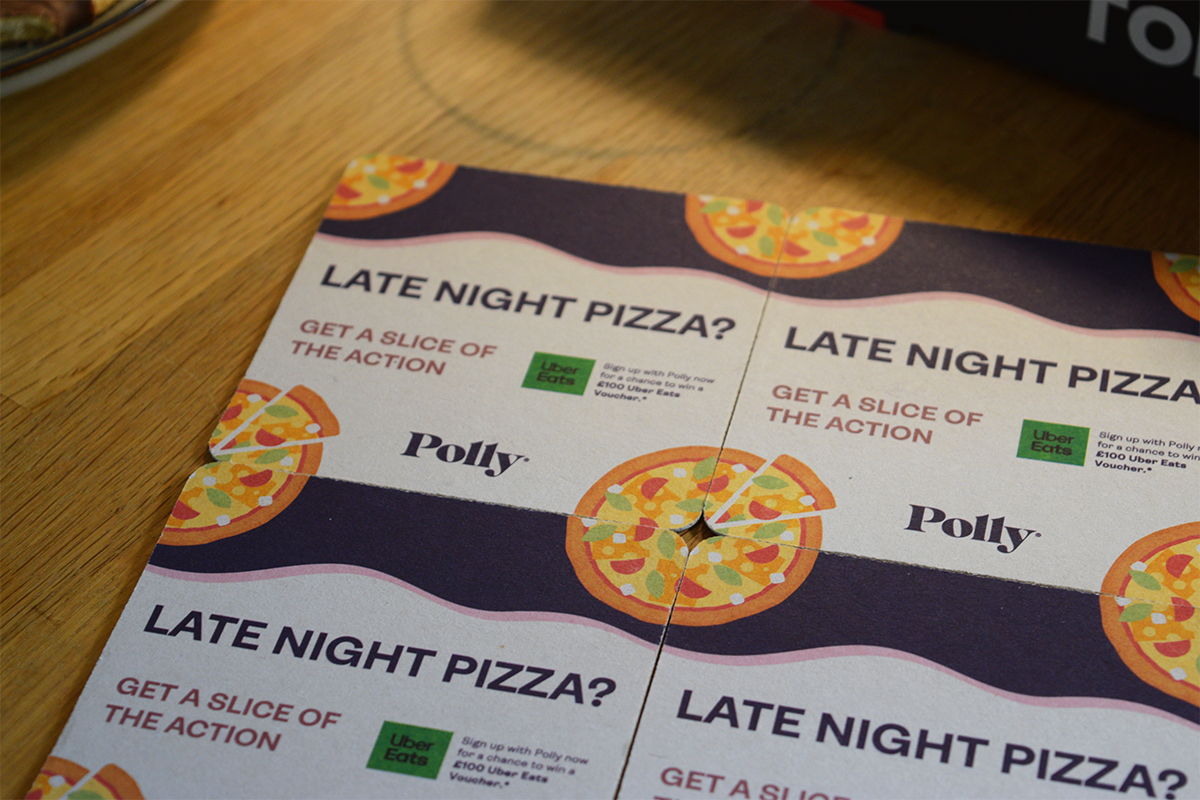
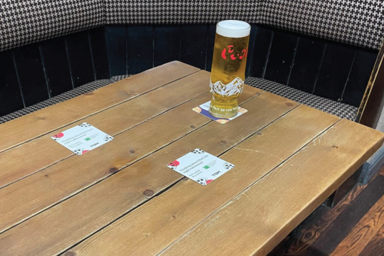
This idea is best described when looking at the beer mats I designed. I wanted to incorporate another level of interactivity to the design that went beyond simply using it as a beer mat. Thinking on my own experiences with beers mats and how while I’m sat at table talking to my friends/family I find myself looking at and playing with the beer mat. This paved the way to the wallpaper design you can see detailed below in these pictures. The idea that you can reveal the full illustration of the beer mat by arranging them in a 2 X 2 grid. A somewhat ‘reward’ for the viewer playing with them. Not to mention I made this aspect work across the two brands, making both the Tom and Polly beers mats reveal the same image despite the branding being different.

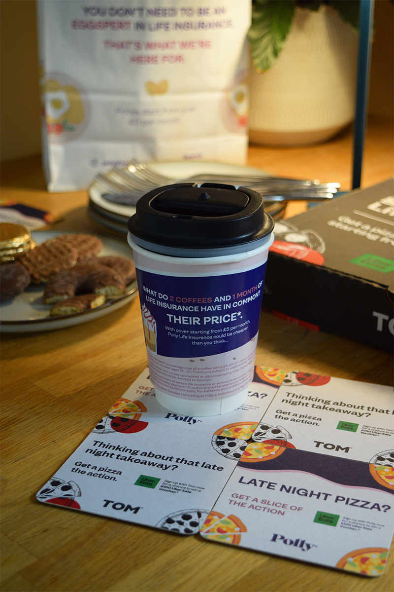
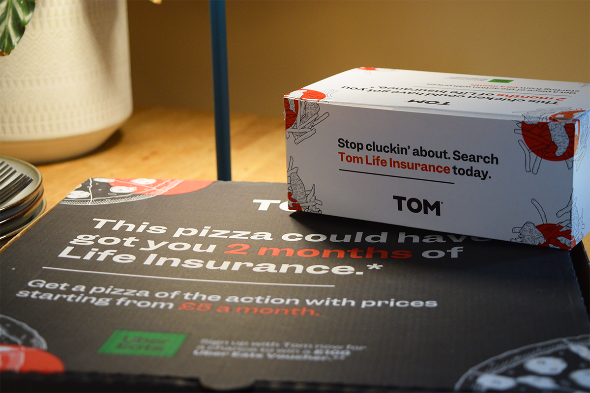
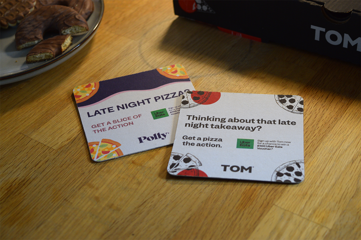
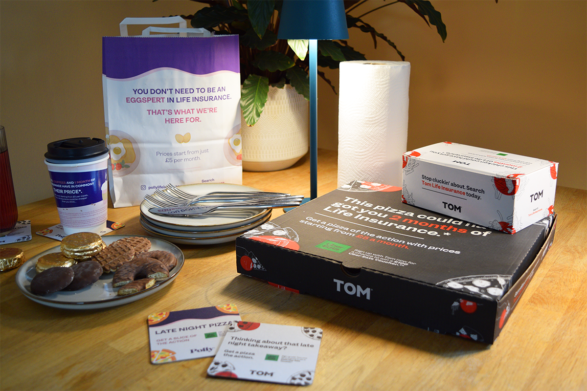
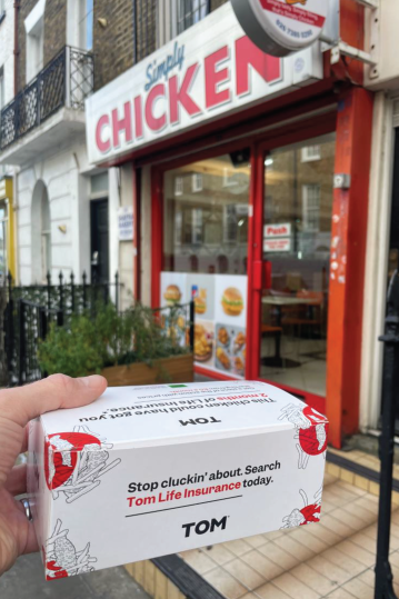
I tried to replicate this style idea throughout the packaging to both fit within the style and to hopefully grab other attention in the same way just in a different setting.
Disclaimer: I do not claim to own the works detailed in this page. Ownership belongs to that of Clark UK.