Rehome came to Sparkloop in 2022 with a complete re-brand project. From the logo to the website, they wanted a fresh new look to their identity and brand. Rehome are a company that look to repurpose old kitchens with a new take and at a cheaper rate than the retail price. While sustainability and their love for interior design is important to them, Rehome wanted to express the love and warmth a new kitchen can provide to a home through their identity.
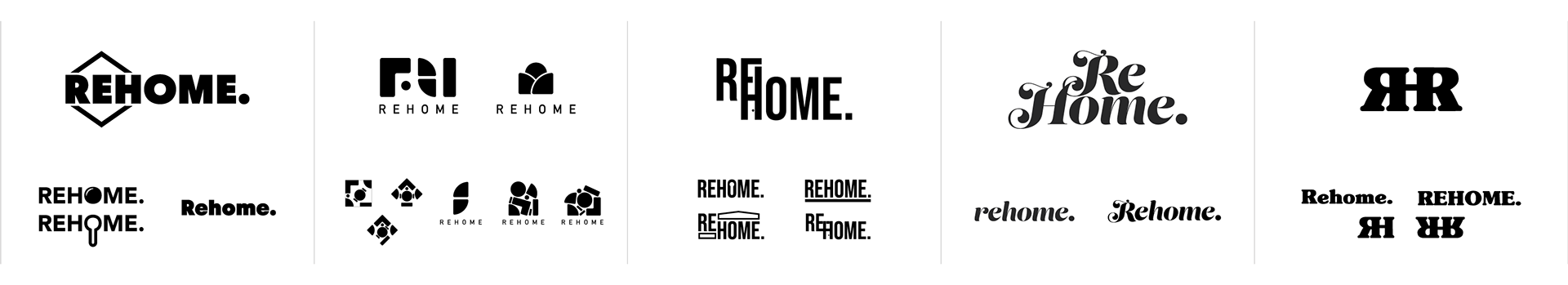
As a team we used mood boards and general research to decide the general look and feel we were after. After that, we went away individually to craft some logo ideas. Detailed below you can see some of my key concepts that I developed up as part of the Sparkloop team.
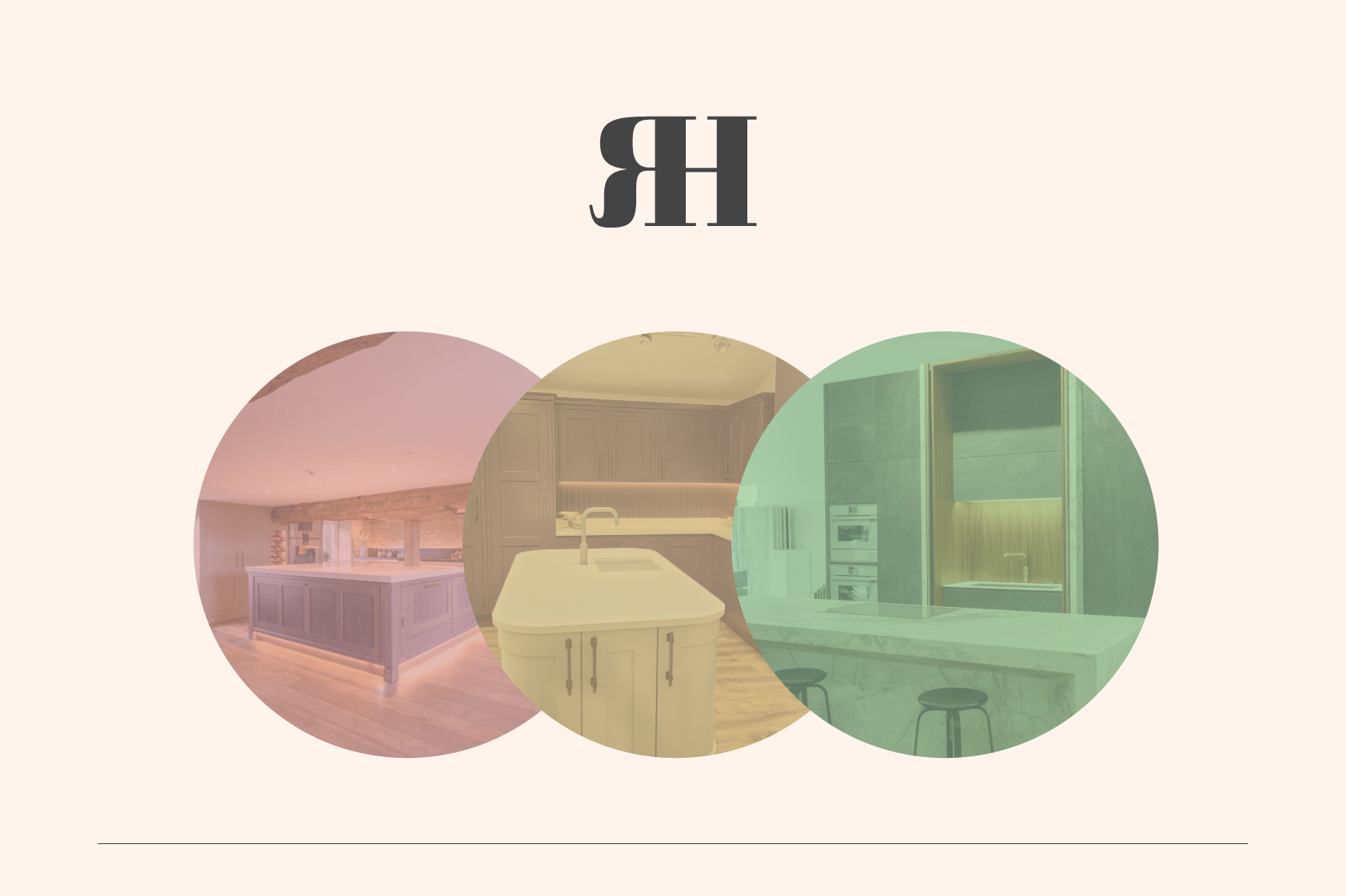
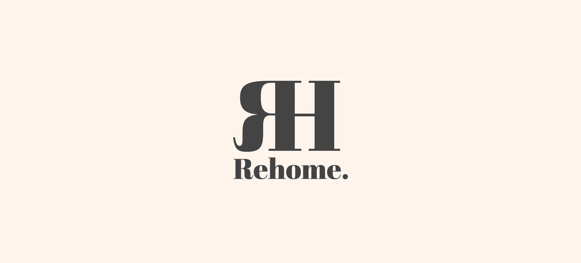
Delving in on our favourite concepts as a team, we fleshed them out individually to see where the concept could go. We decided that my heavy serif concept was the best of my ideas to move forward with and I went away and further developed it. The development included adding a colour palette and the Rehome imagery we were provided.
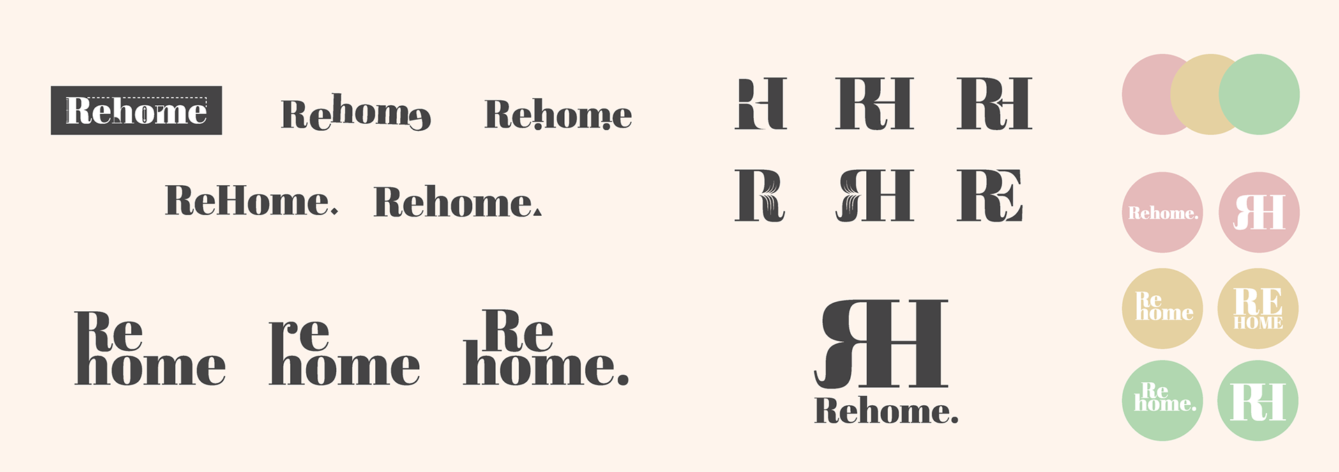


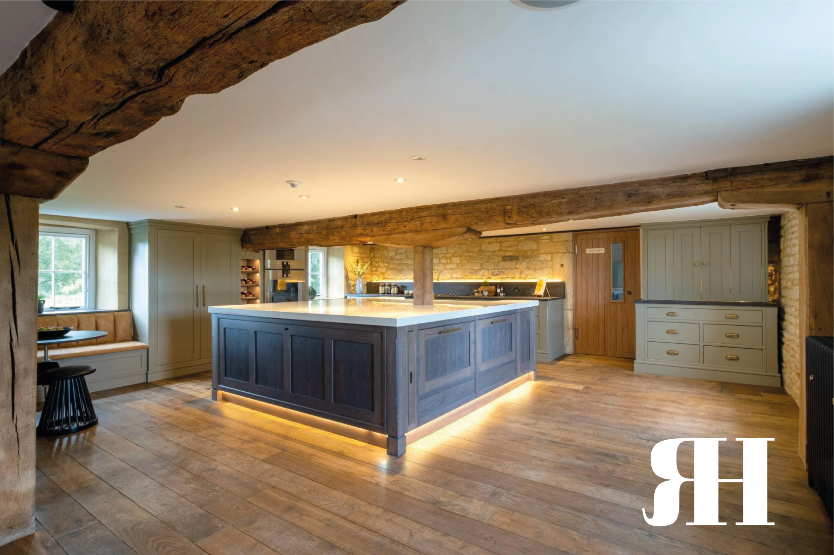
After many different feedback sessions with Rehome, we whittled down the concepts we preferred the most and moved forward with them. Another member of the team’s designs was chosen to go forward and I was able to continue to help out with some of these concepts. Below is one of the concepts another team member had created to which I helped craft supporting imagery to feature in their mock ups for Rehome.
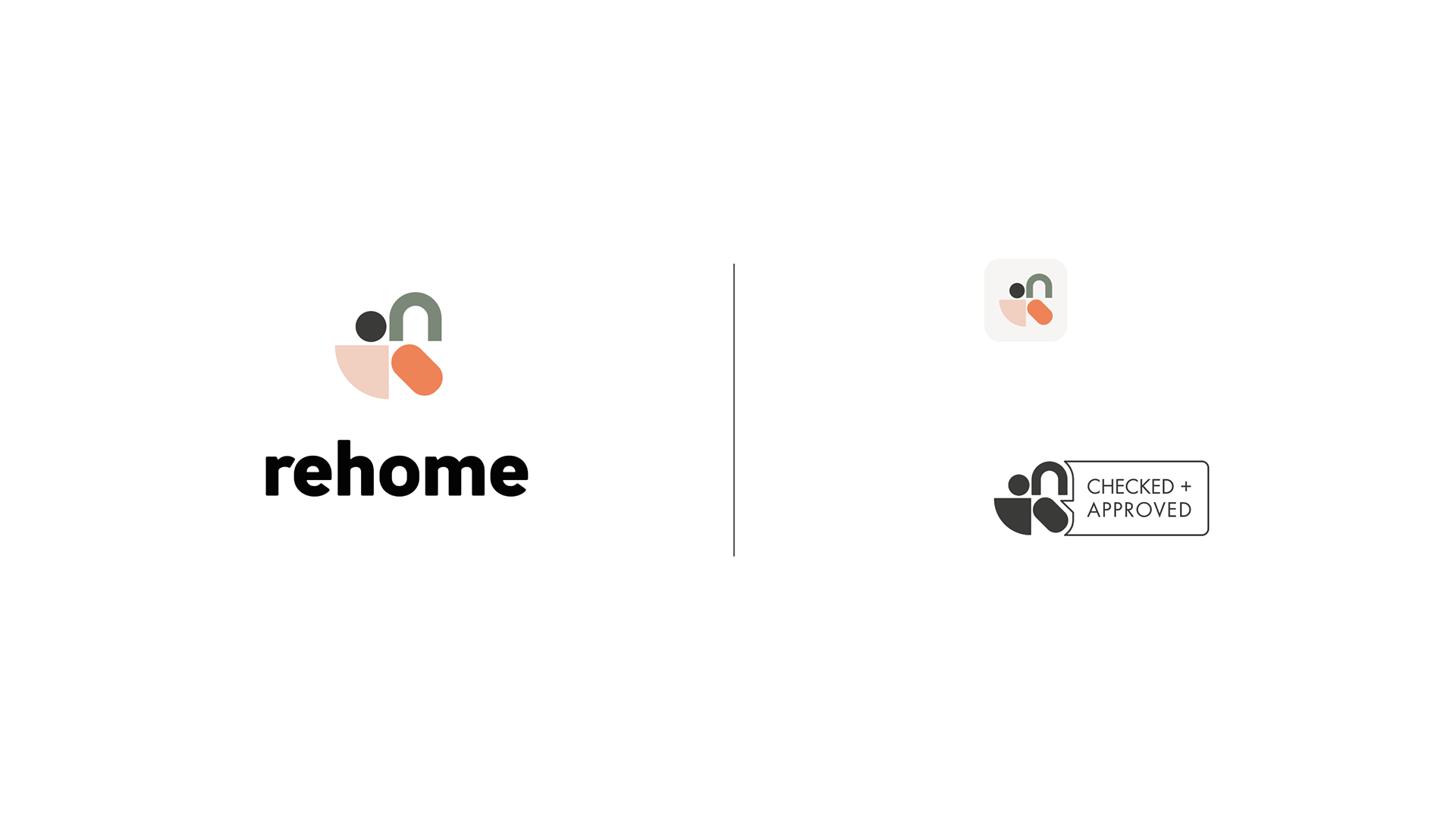
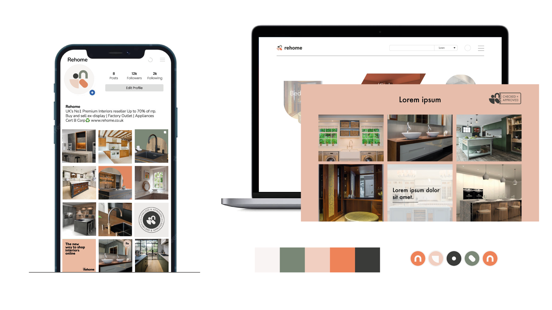
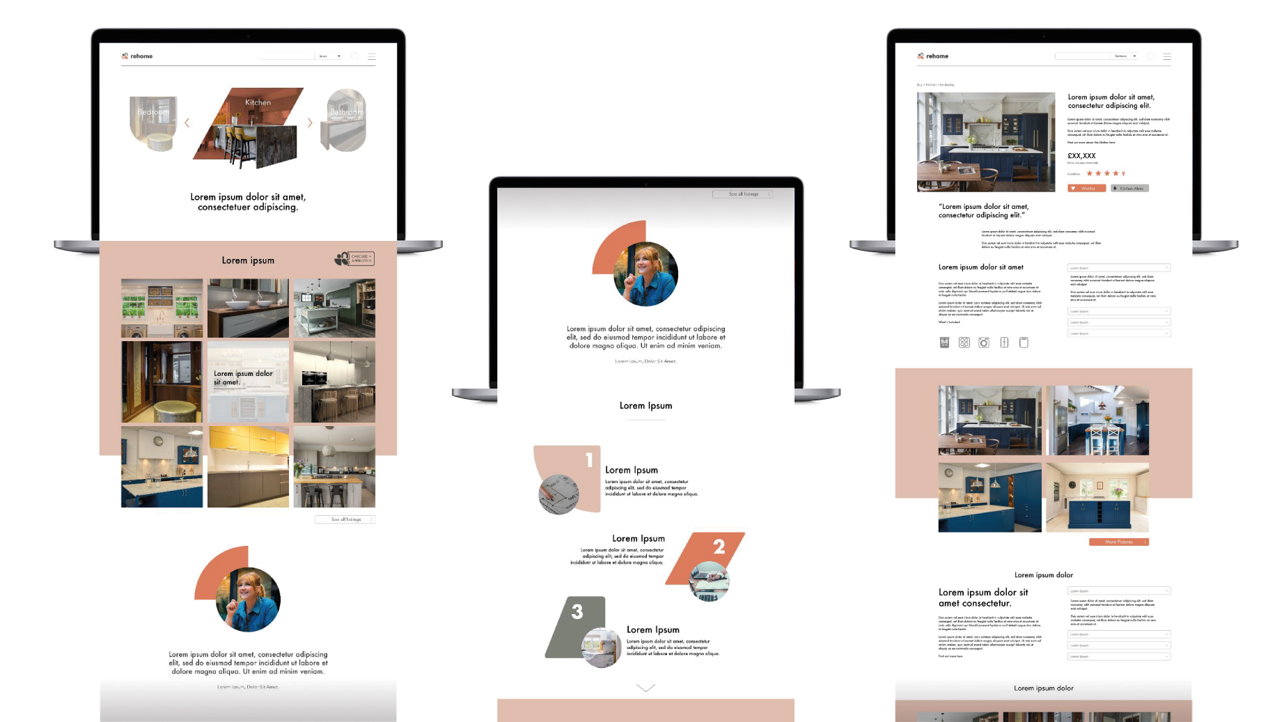
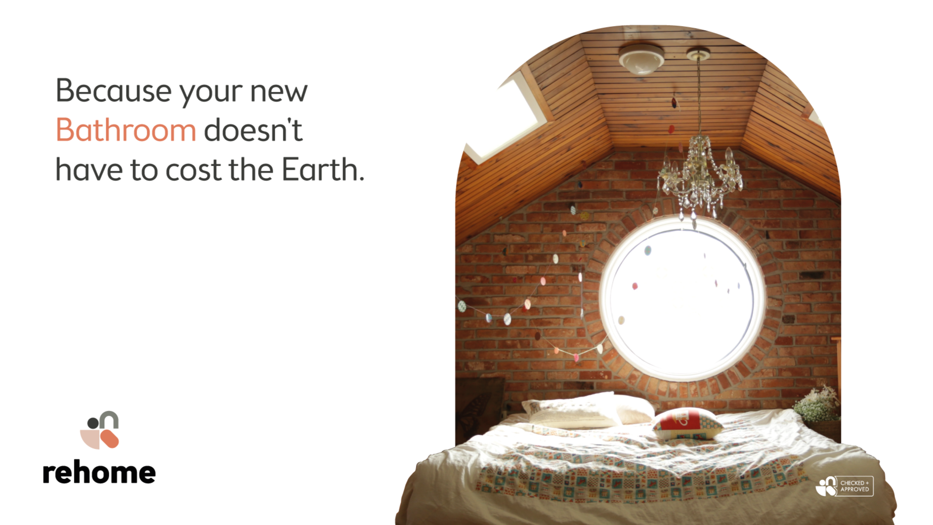
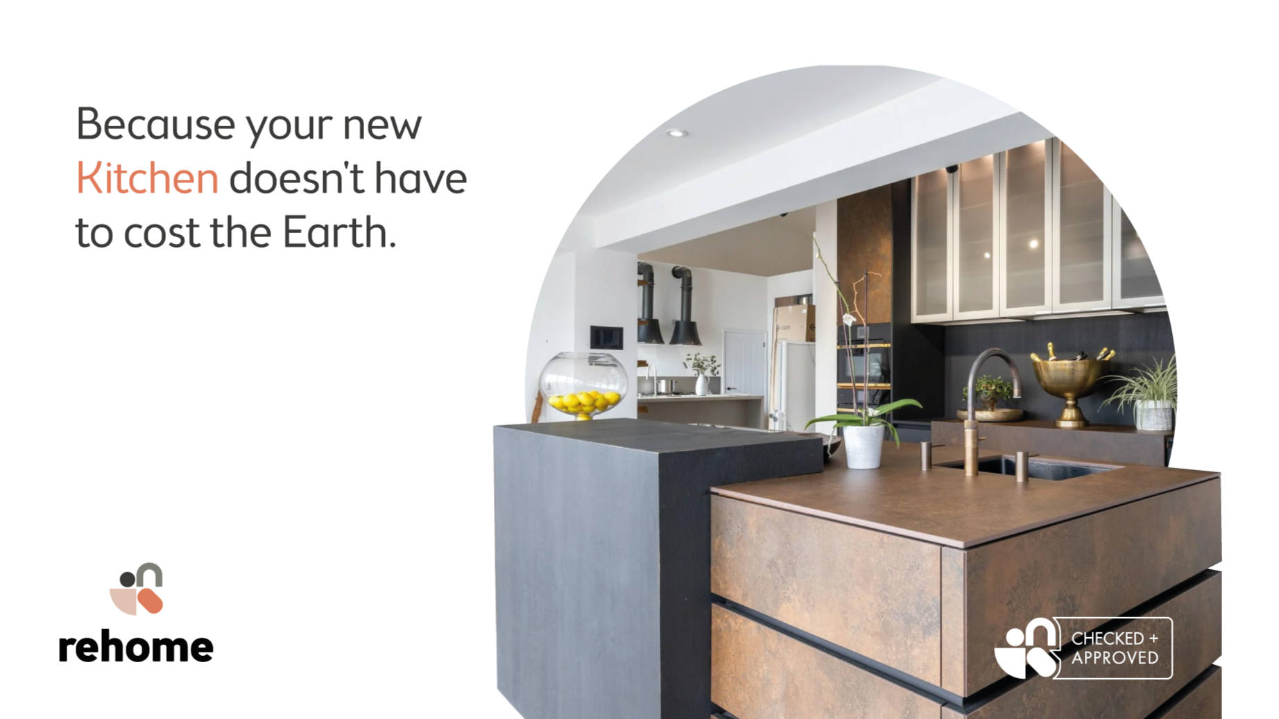
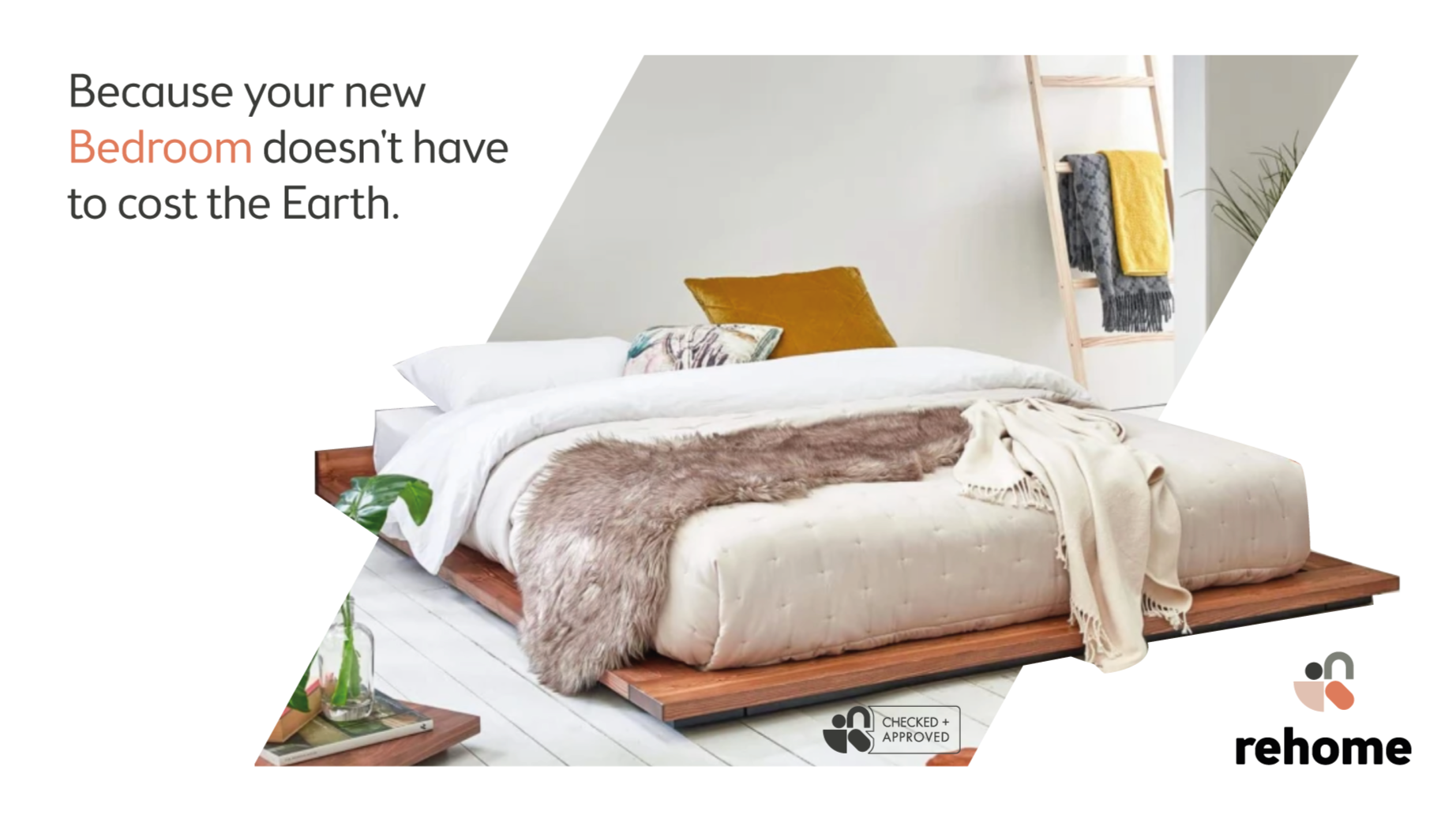
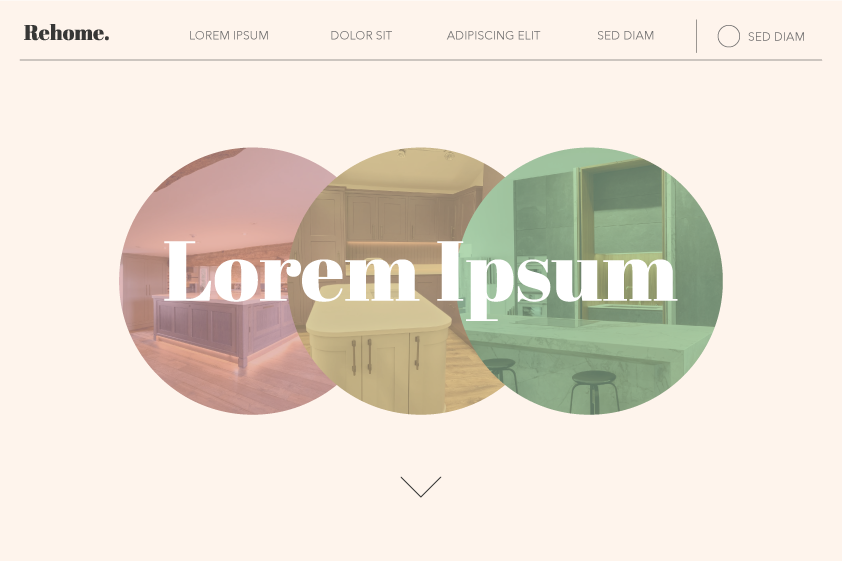
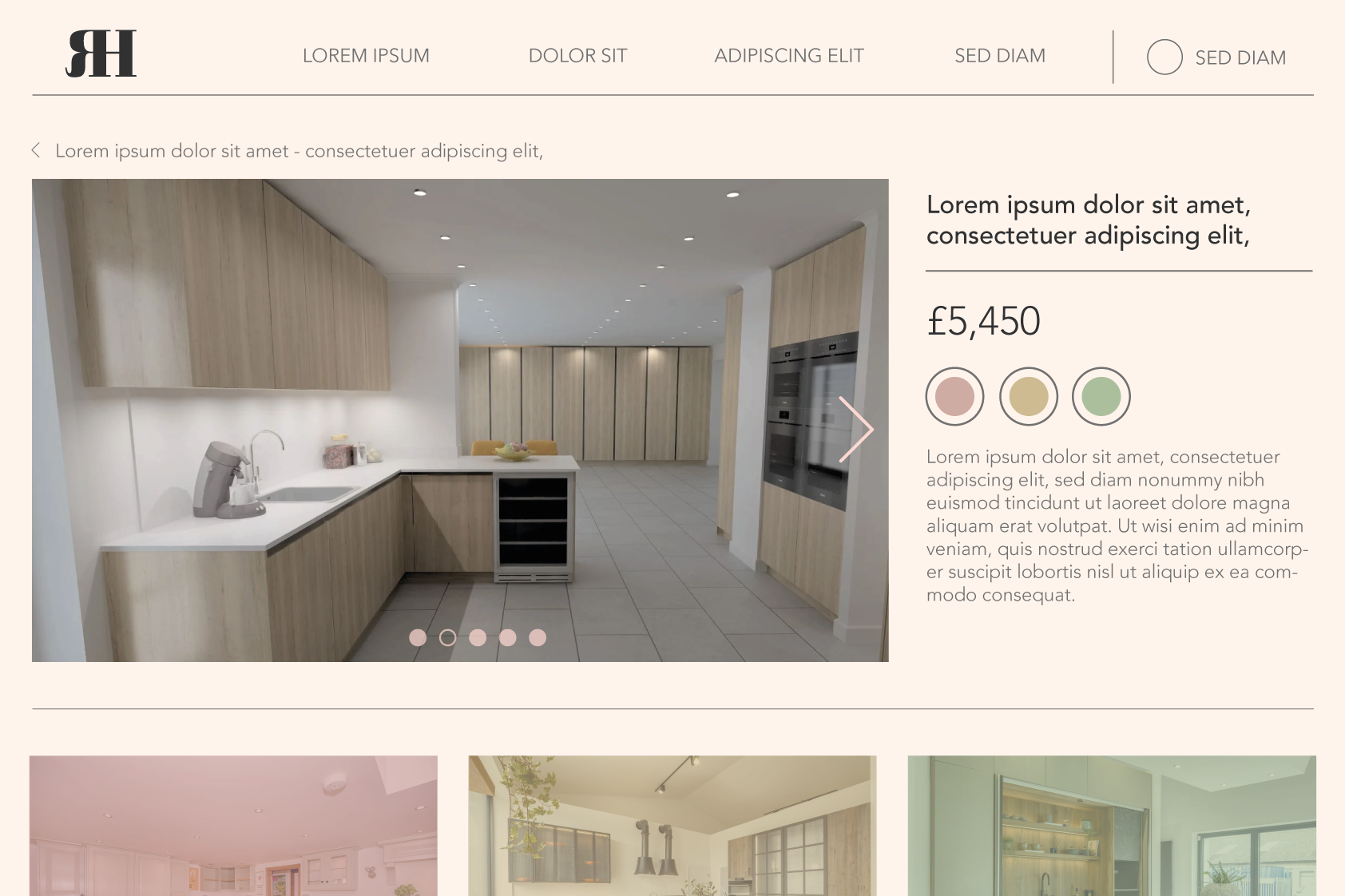
The concept Rehome went for in the end was a pulled back version of the design above with some aspects taken from various other design such as colour schemes, imagery, fonts etc.. You can see the identity in full swing here.
Disclaimer: I do not claim to own the works detailed on this page. Ownership belongs to that of the client under the creation of Sparkloop.