
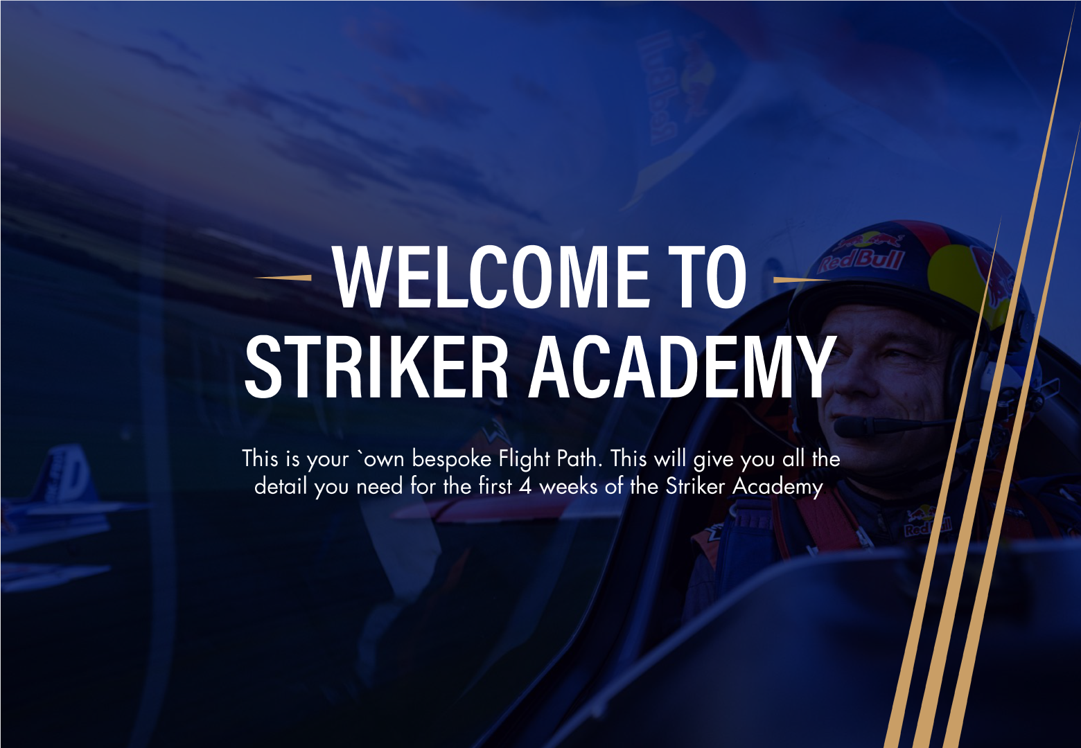
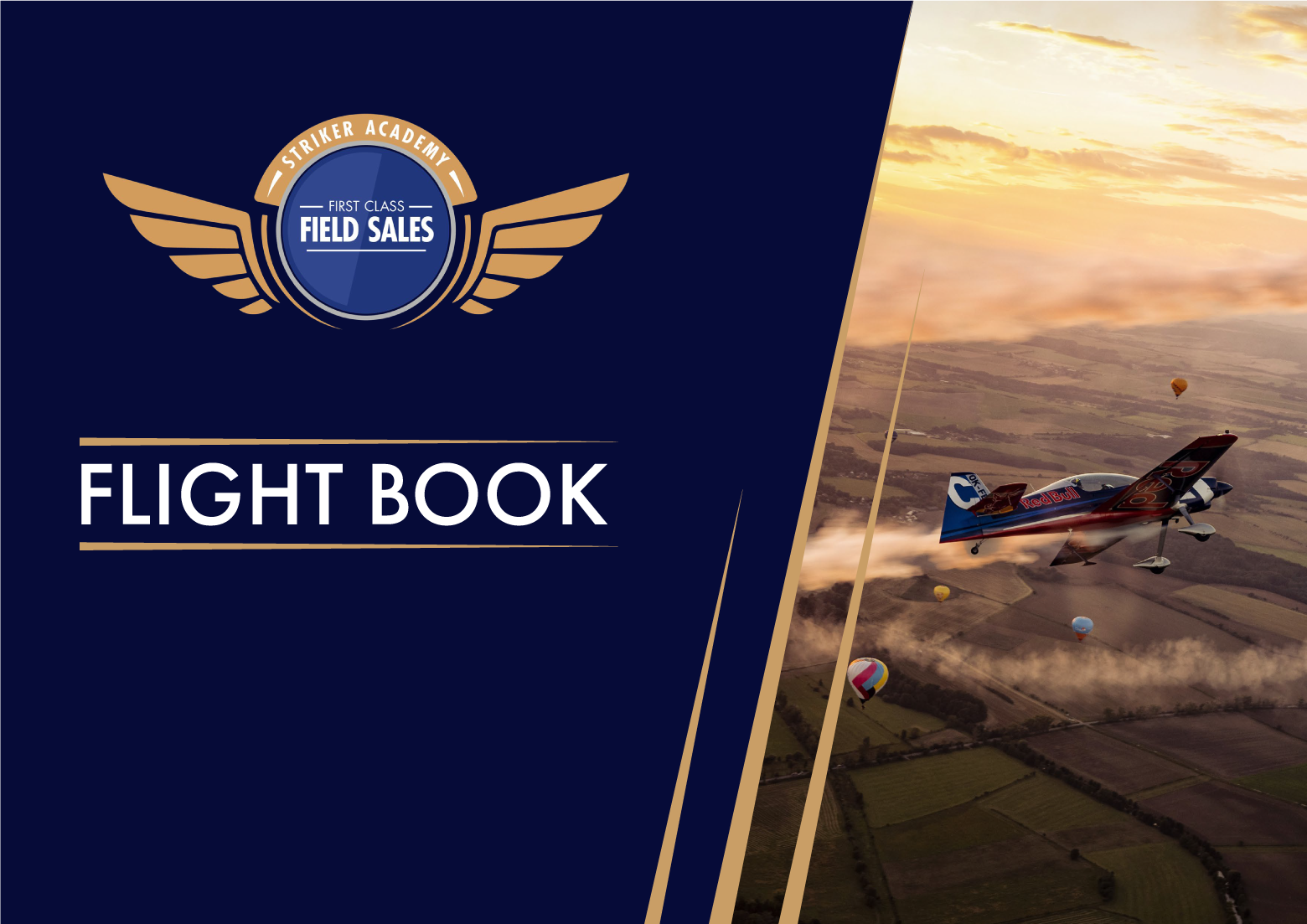
For this project, Red Bull wanted Sparkloop to create a mini-identity and training material for the expansion of their Grocery Field sales team. This included a logo for the expansion, induction documents for the new members being trained and a training handbook that they deemed ‘The Flight Book’. The term for the handbook was something used on previous projects for them, so we took this theme of flight and expressed it both through the visuals and terminology within the document - the whole idea of ‘soaring’ and ‘taking flight’ in the new role.

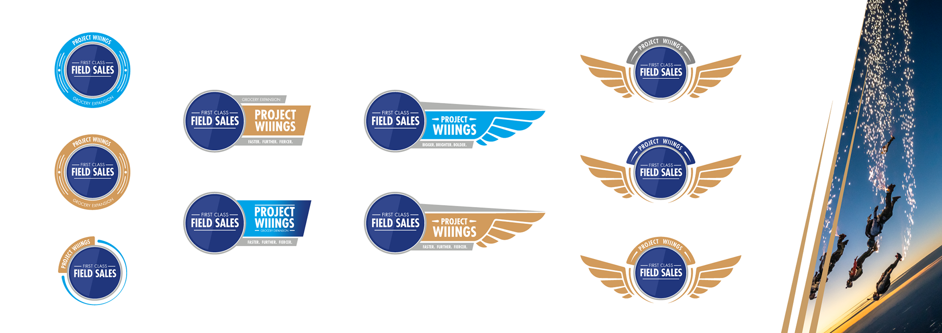
With the logo direction being straight forward and the creative director of Sparkloop knowing the sort of thing Red Bull likes, the design process on this front was very quick. Including wings within the logo to better re-iterate the ‘flight theme’ was a given.
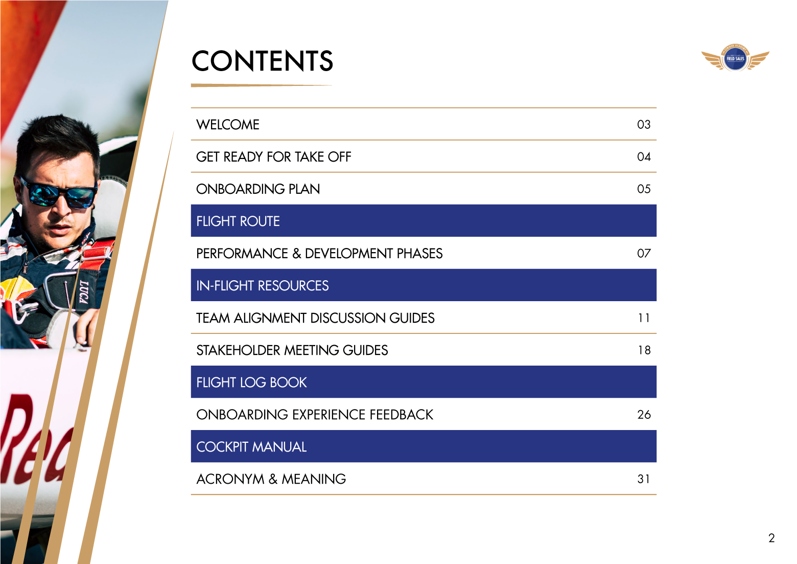
When it came to designing the look and feel for the rest of the material, again, we knew where to start. After pulling appropriate imagery from Red Bull’s library, I started experimenting with how we could best display them and what supporting graphics and font could be used. Thus, landing on this full bleed, overlayed imagery style with ‘Speed Line’ graphics.


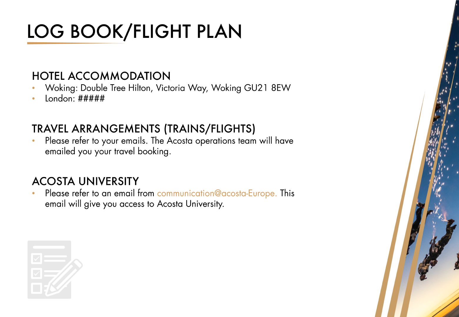
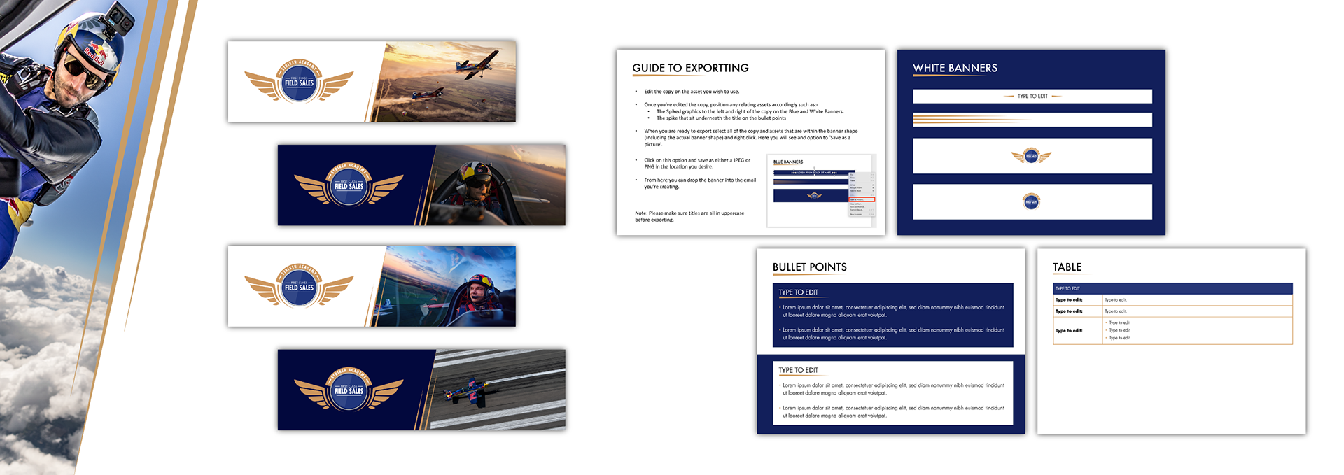
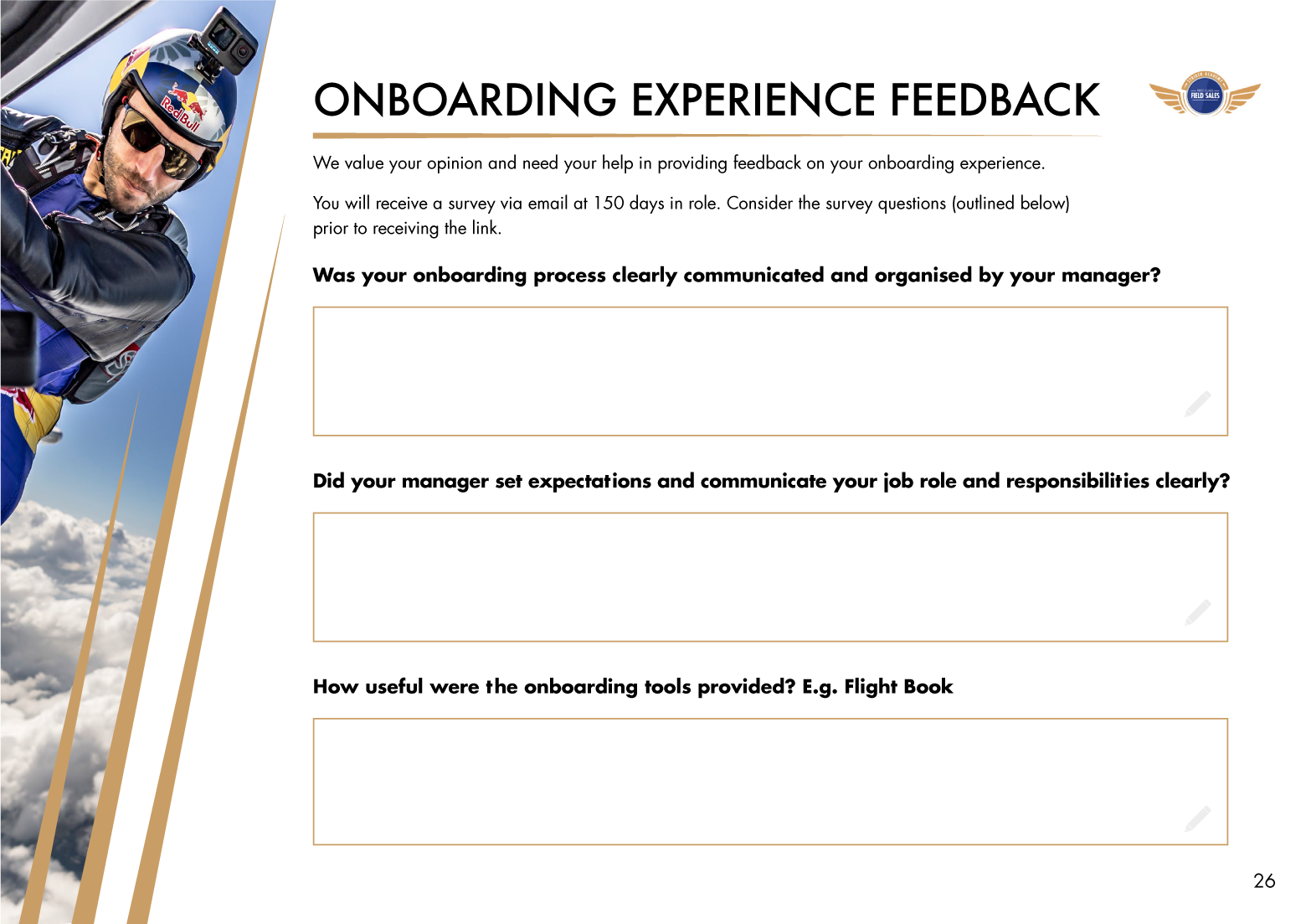
The most time-consuming aspect of this project was creating the content. With the content still coming in for the duration of this project the deadlines were quite quick. This included creating two different PowerPoint templates for the team to use, email banners and assets that they could edit and export on their end and a full interactive PDF workbook.


Disclaimer: I do not claim to own the works detailed on this page. Ownership belongs to that of the client under the creation of Sparkloop.