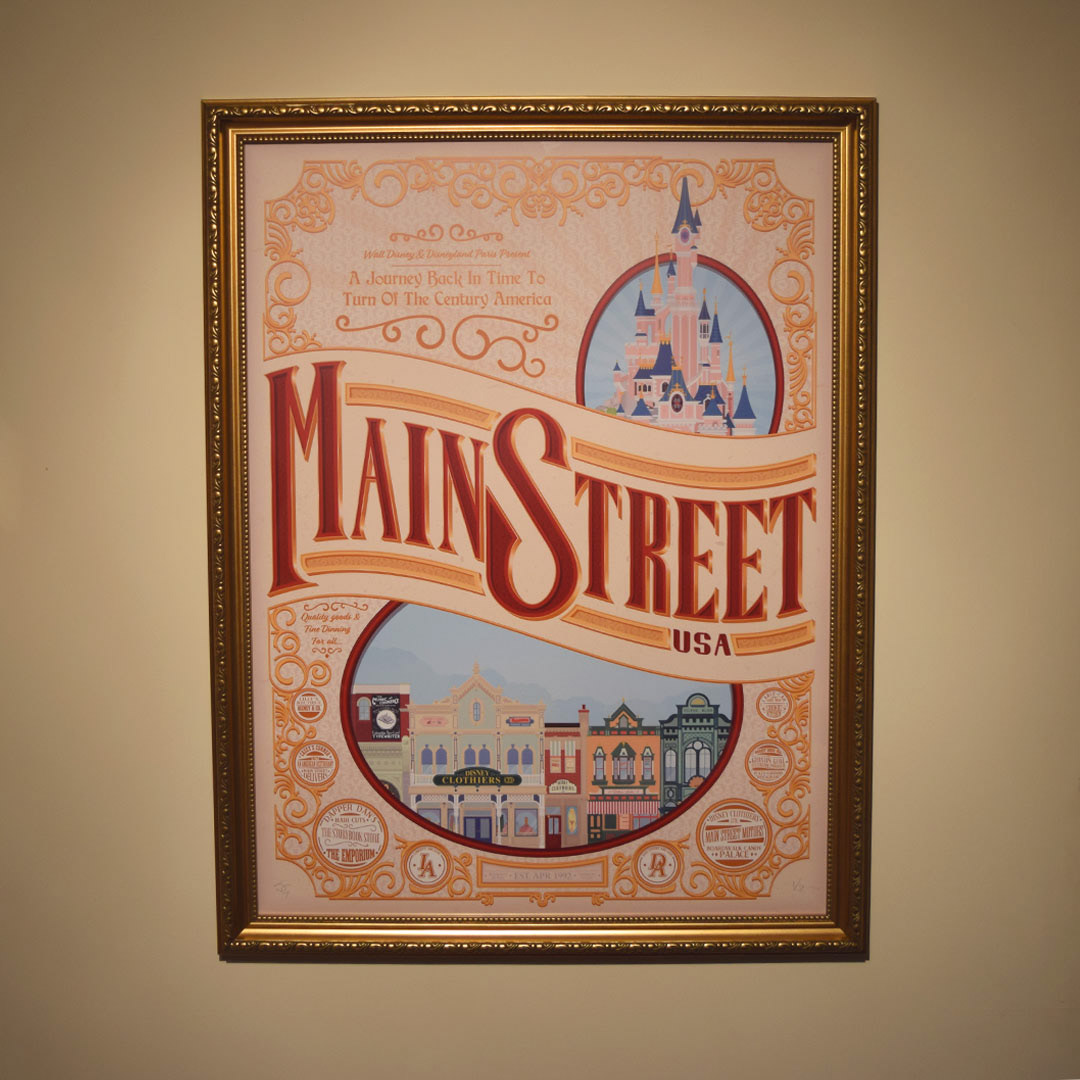
When planning the piece, I took my usual steps and started off creating a couple of mood boards and mind maps in order to generate some ideas. Once settled on an idea I then started with the asset creation.
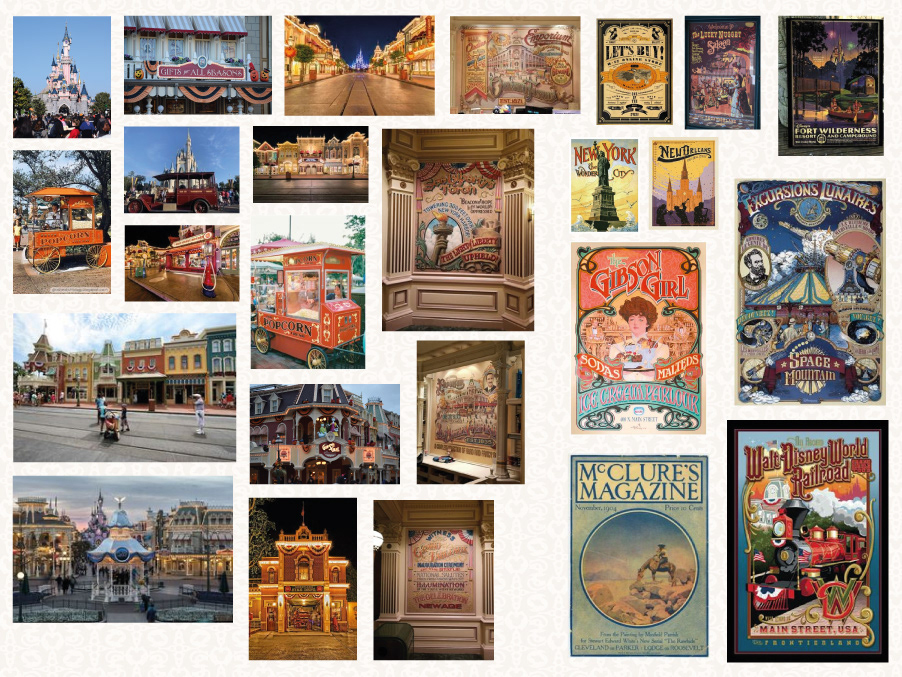

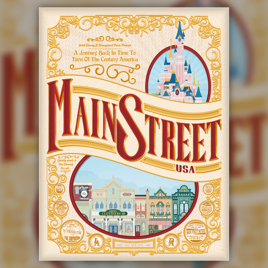
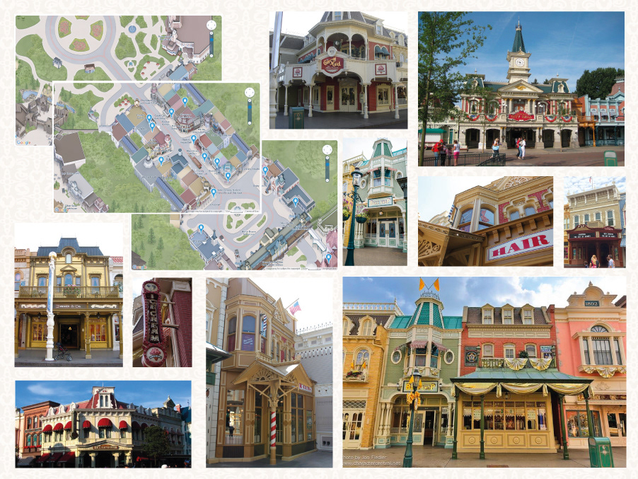
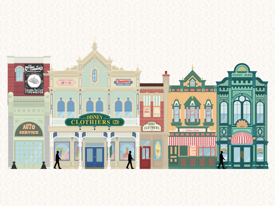
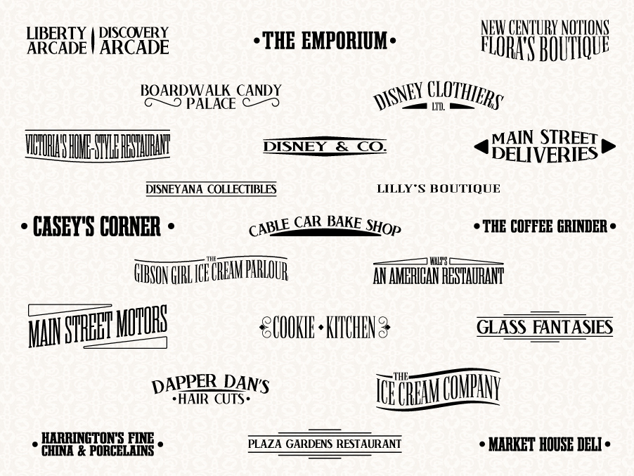
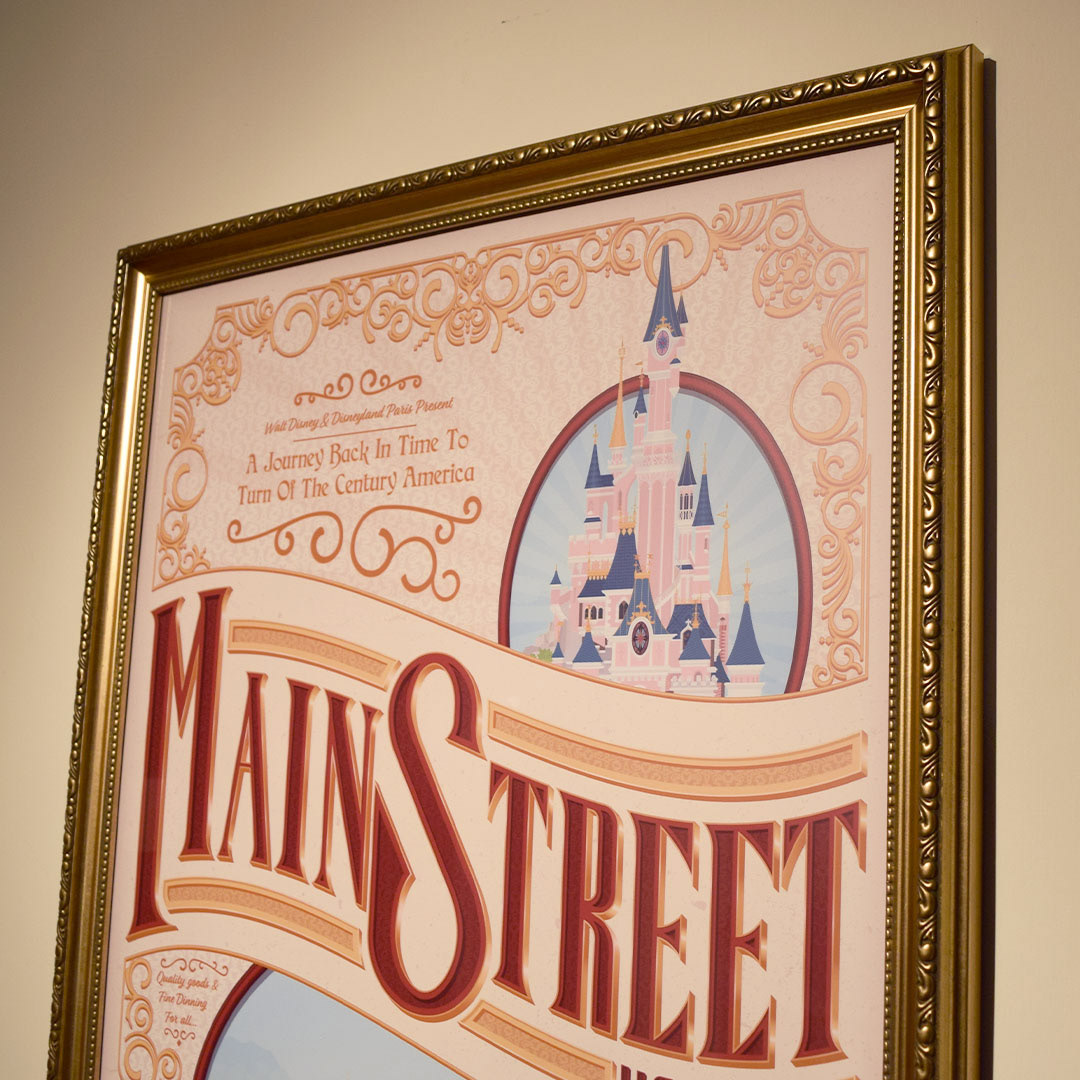
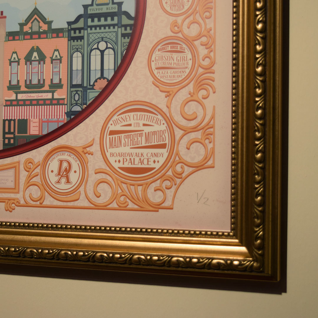
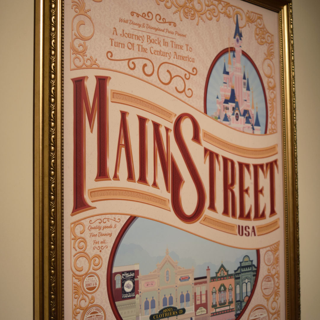
The first thing I wanted to create was the Mainstreet buildings as this was one of the more important parts of the piece. I created some secondary mood boards charting the order of the buildings on Mainstreet and then chose a certain stretch to illustrate.

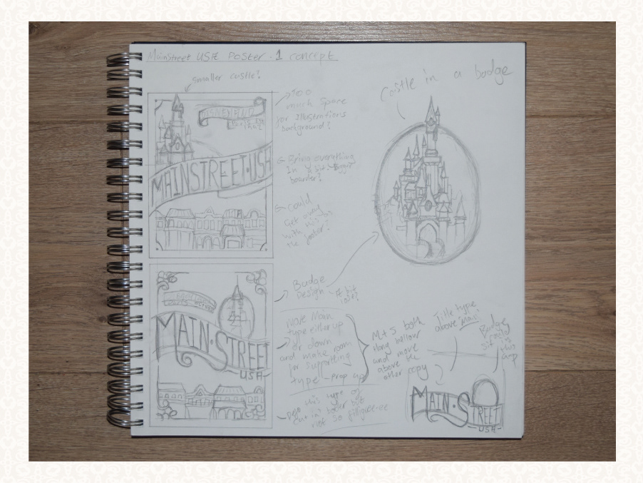
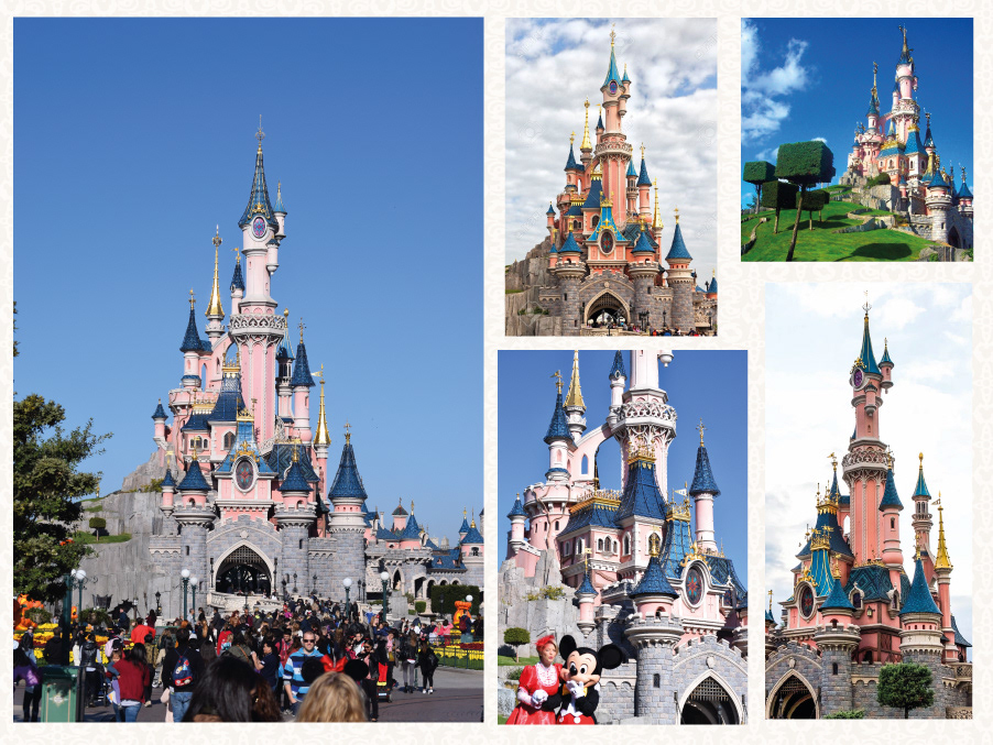
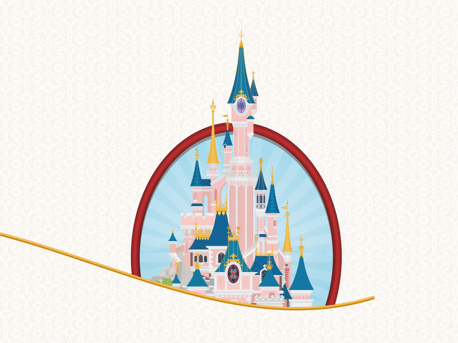
After creating the buildings, I moved onto the Disneyland castle using the same process. However, because the castle was a lot more detailed, I decided to break it down into manageable chunks that I would then layer up on top of each other.

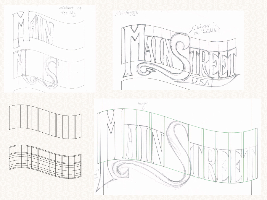
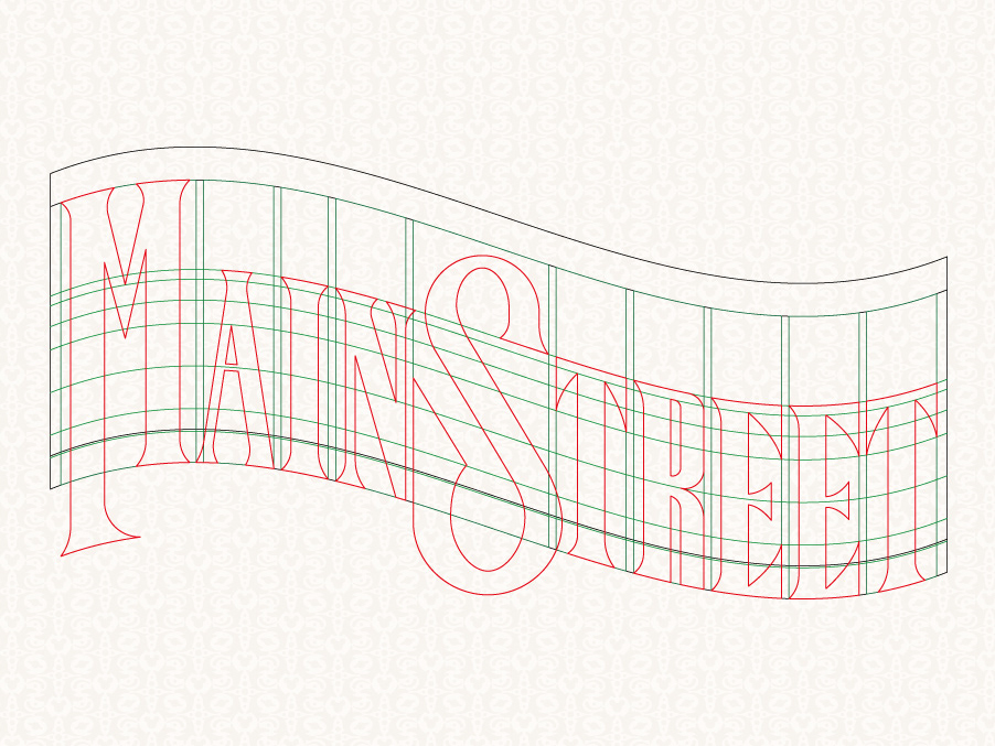
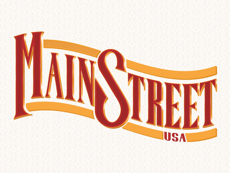
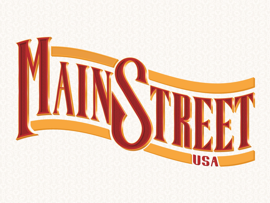
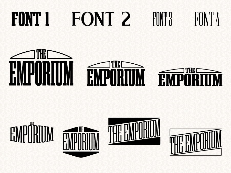
When it came to designing the Mainstreet lettering I wanted it to reflect the kind of style and design you would see while walking through Mainstreet. So, I put together another mood board of posters you might find there. From here I followed my usual process of type creation by first sketching up basic ideas and then taking them back and forth from screen to sketch to refine the idea. Once settled on an idea, I then created a template to design the lettering on top of and crafted the final design.


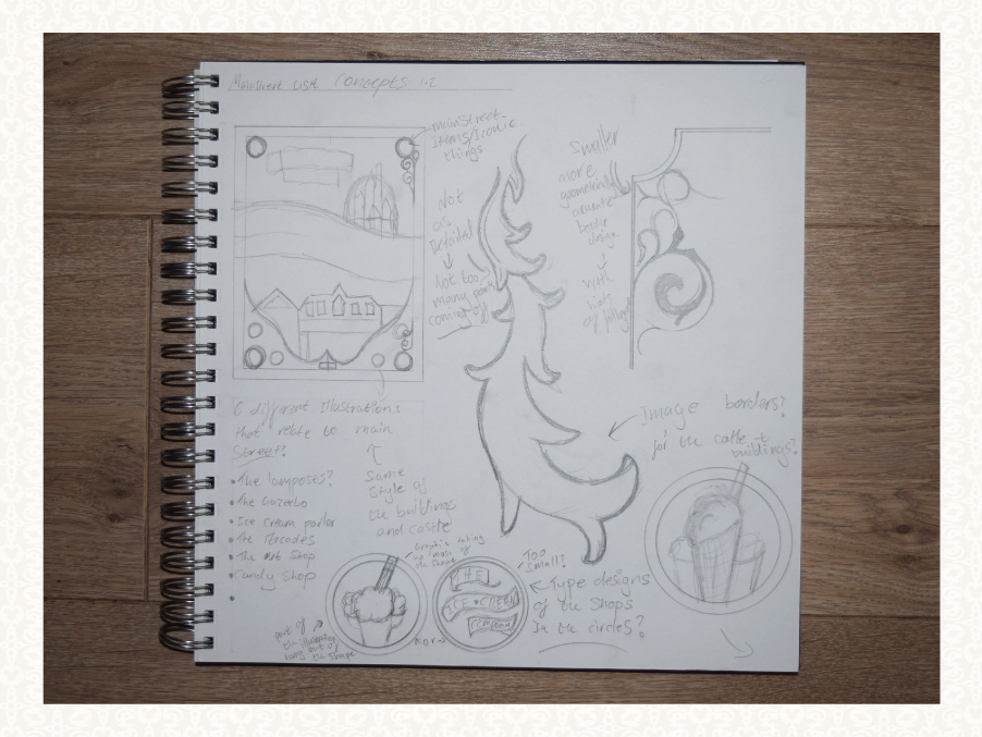
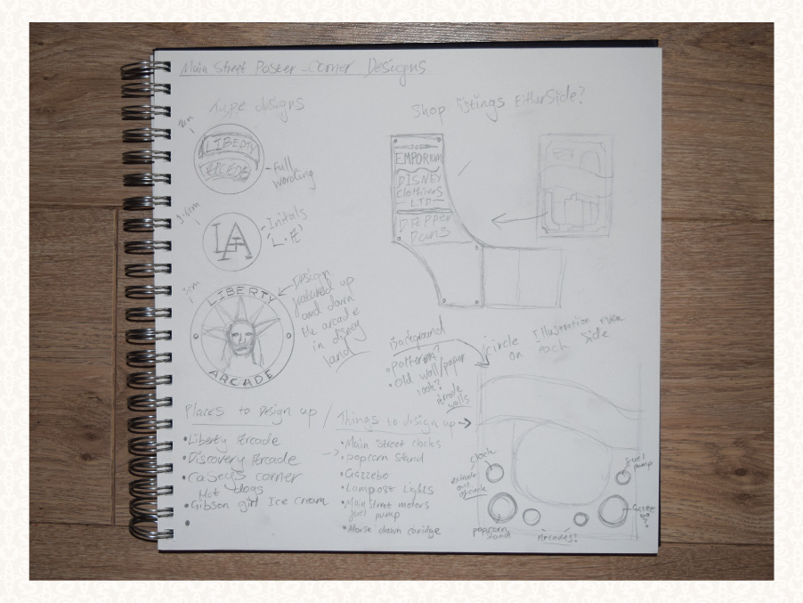
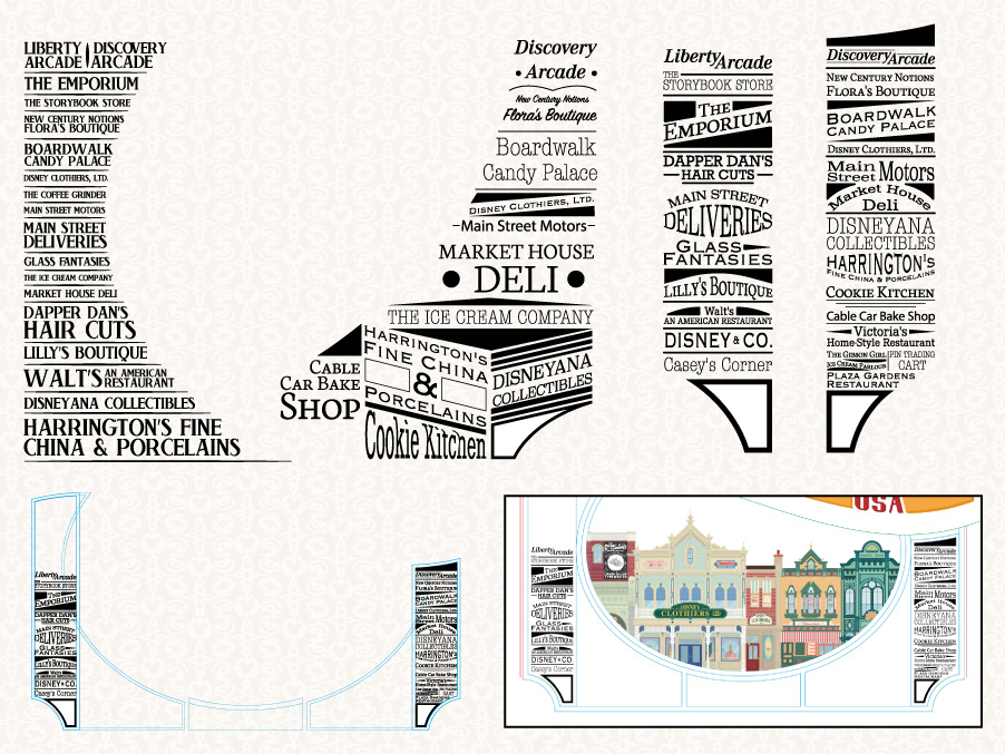
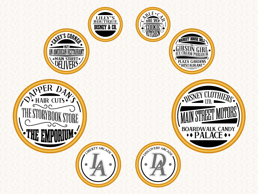
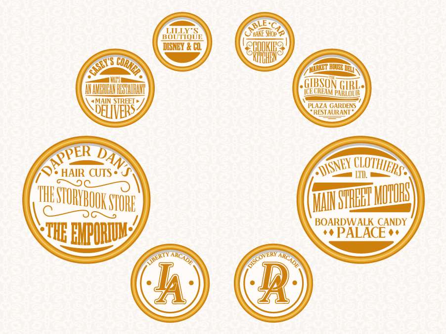
I went back and forth on a few different ideas of how to display the main street shops on the poster as you can see below. I finally settled on the idea of displaying them in individual circles that would then sit in the border round the poster which looked a lot more fluid than any of my other ideas.
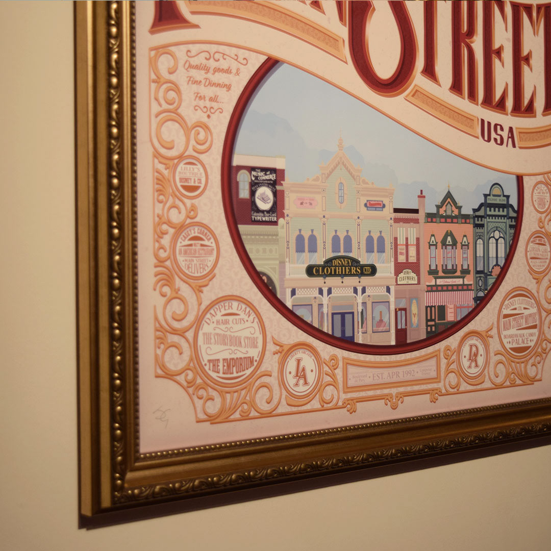
After getting the poster printed, I then found an old-fashioned frame that would help emphasise the pieces turn of the century style.

A process video from concept to final piece