Having never really worked on logo design for individuals before, let alone an interior designer, I found this brief to be a challenge in a good way. The approach to the brief was very simple. Through the design we wanted to hit the high end feel that represented Gabrielle’s style of design. Already having a great idea of the look and feel she was after through her website, we set to work on drafting up concepts and ideas that helped emphasize this.
Our focus on creating type-based logo designs became very clear after our initial research and discussion period of the project. We felt this was the clear route to go with for someone in the sector Gabrielle was in.

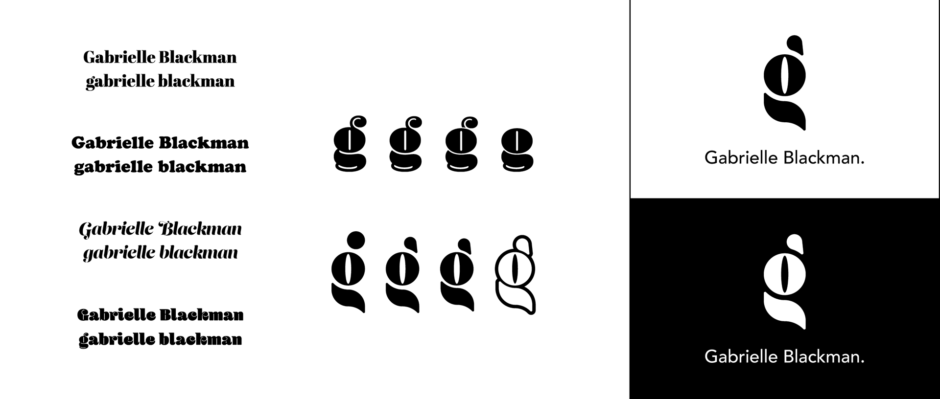


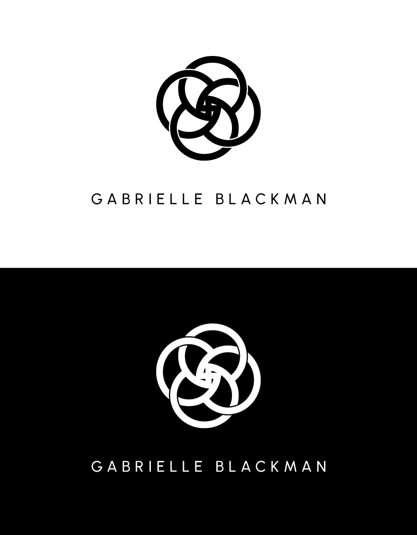
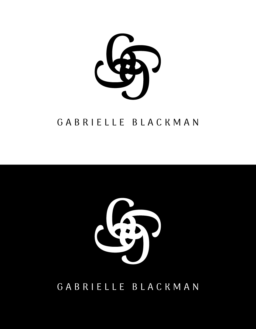
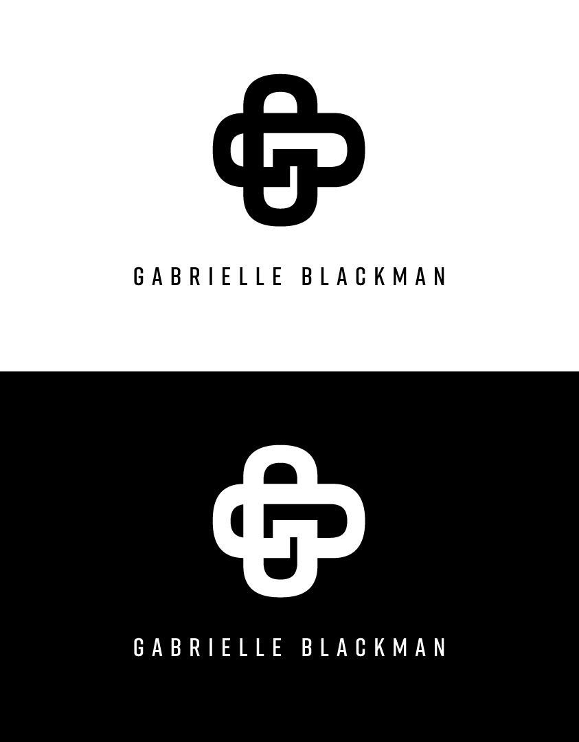
I set about finding the right font to best represent the client and then moved on to developing a logo based around this. The logo and copy would work in conjunction with each other, while also working individually in different formats such as social media profile pictures and URL icons.
Experimenting with chosen copy to form patterns and icons was something I found to be quite insightful and enjoyable. I had never really experimented with this technique before but when we decided as a team to look into this route, we all took it in our stride and came up with some great results.
Although my route wasn’t the final chosen design, I am still very proud of my final outcome and still use this approach to logo and icon design to this day.
Disclaimer: I do not claim to own the works detailed on this page. Ownership belongs to that of the client under the creation of Sparkloop.